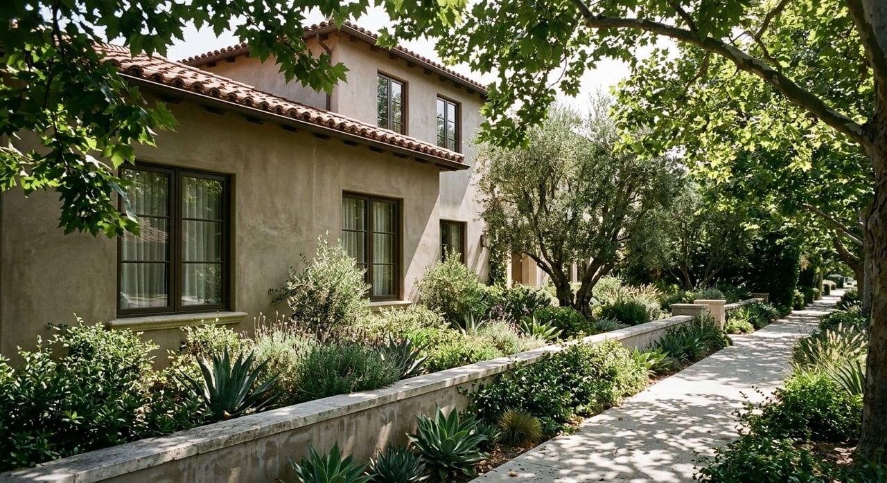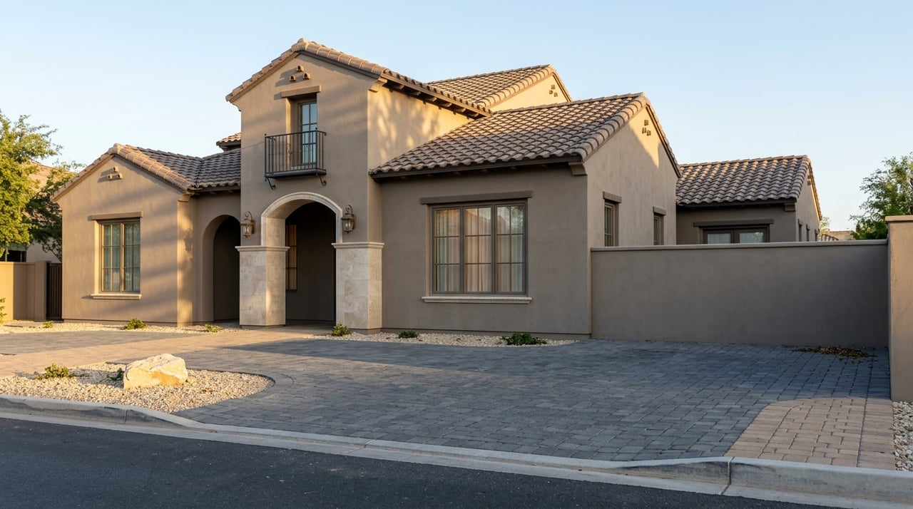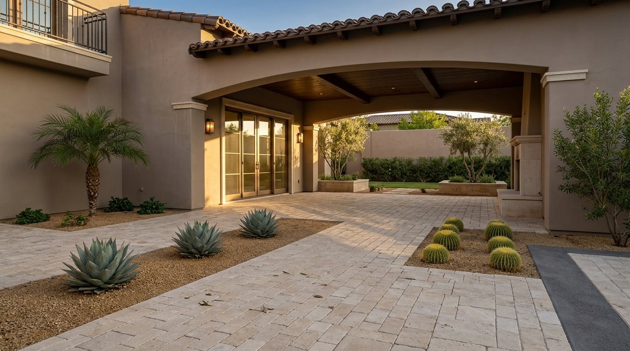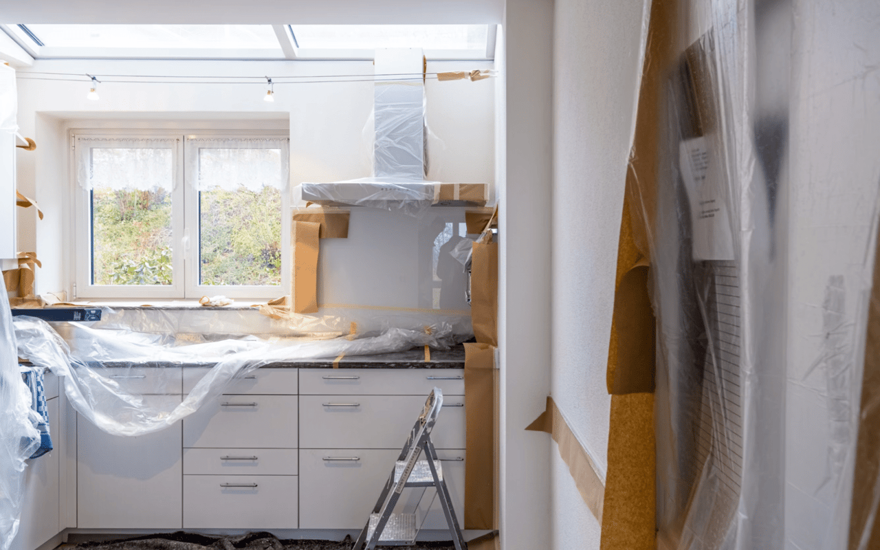
Choosing paint colors may seem like a simple design decision, but it’s one of the most powerful ways to shape how your home feels and functions. The right color can make a small room appear larger, create calm in busy spaces, or energize areas that need a lift. Behind every beautiful color scheme is a bit of science—psychology, light reflection, and even temperature perception all play a role.
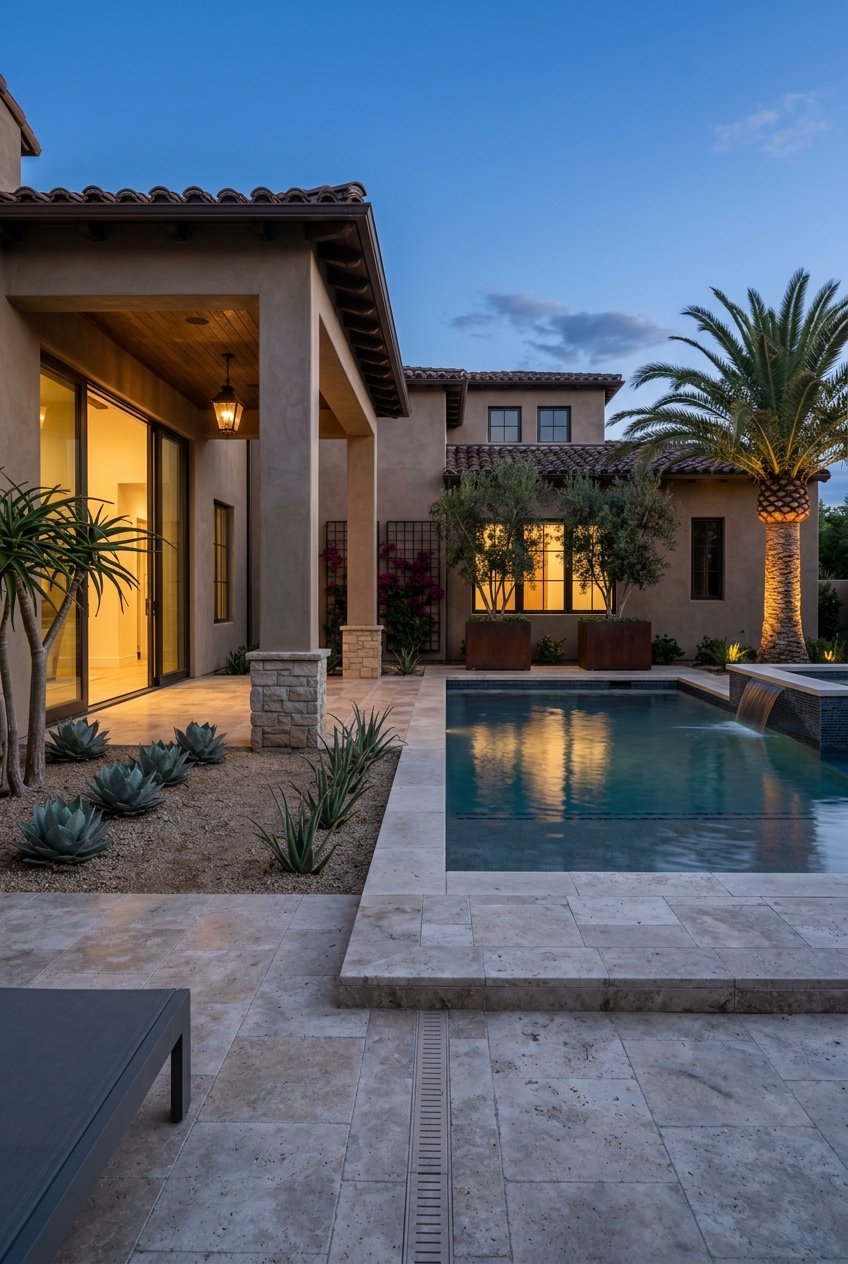
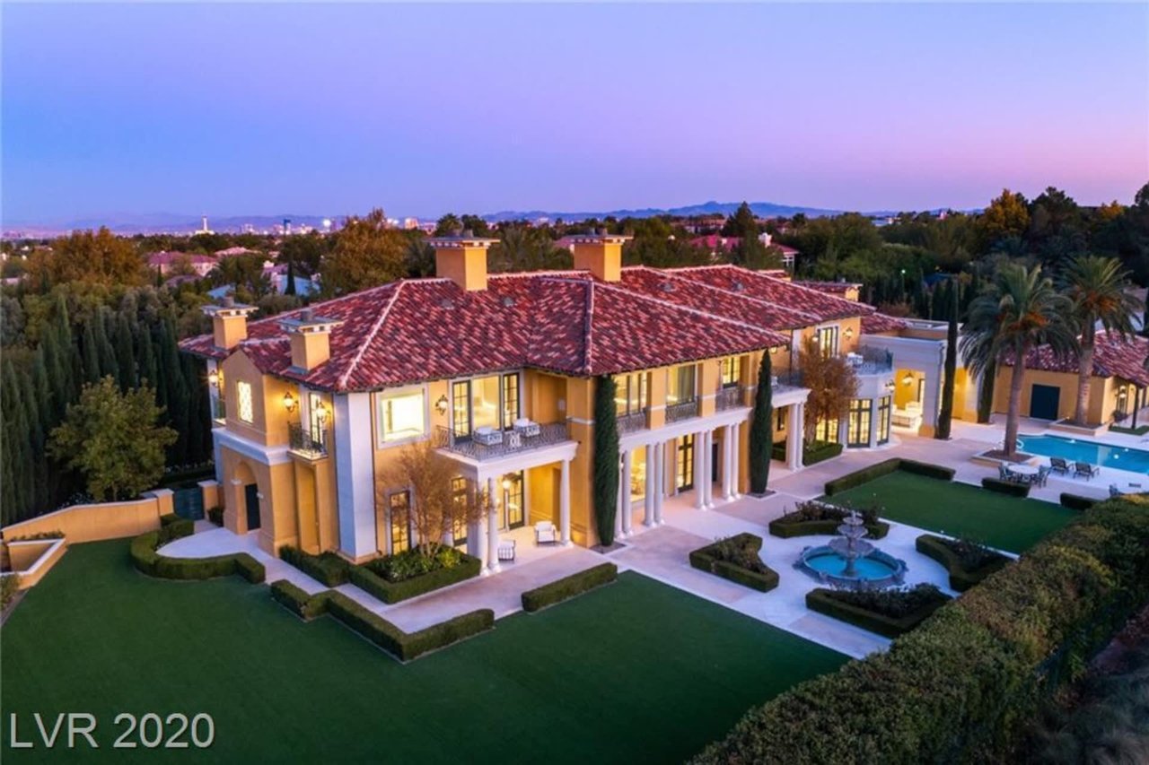
Whether refreshing your Las Vegas home or preparing it for the market, understanding how color influences mood and design will help you make smart, lasting choices.
Understanding the Psychology of Color
Colors aren’t just visual—they evoke emotions and affect how we experience a space. This concept, known as color psychology, is key to creating harmony throughout your home.
- Warm colors like red, orange, and yellow energize and stimulate conversation, making them great for social spaces like living rooms and dining areas.
- Cool colors such as blue, green, and violet are calming, ideal for bedrooms and bathrooms where relaxation is the goal.
- Neutral tones like beige, gray, and white create balance and flexibility, serving as timeless backdrops for any décor style.
Before choosing a color, think about the mood you want to evoke in each room. A soothing blue bedroom can promote better sleep, while a soft yellow kitchen may feel cheerful and inviting.
The Role of Light in Color Selection
Lighting dramatically affects how paint appears on your walls. The same shade can look completely different under natural sunlight versus artificial light.
- Natural light: In spaces with lots of daylight, colors will appear truer to their swatch. South-facing rooms in Las Vegas, where sunlight is bright and intense, may make colors appear warmer. Consider cooler tones to balance this effect.
- Artificial light: Incandescent bulbs add warmth, emphasizing yellows and reds, while LED and fluorescent lighting can make cooler colors pop.
- Time of day: Morning light is soft and warm, while evening light can add golden or orange tones. Always test paint samples at different times of day before making your final decision.
To get the most accurate sense of a color, paint small swatches on multiple walls and observe how they look throughout the day and under different lighting conditions.
Color Temperature and Room Perception
The temperature of a color—whether it’s warm or cool—can visually alter the size and feel of a room.
-
Warm tones advance, meaning they appear to come toward you. They make large rooms feel cozier and more intimate.
-
Cool tones recede, creating the illusion of more space. They work well in smaller rooms or spaces that need an airy, open feel.
For example, a compact bathroom can feel larger when painted in a pale blue or soft mint. A sprawling living room, on the other hand, feels more grounded with a warm taupe or muted terracotta.
The Importance of Undertones
Every paint color has an undertone—subtle hues beneath the surface that affect its overall appearance. Understanding undertones is essential for avoiding mismatches between walls, trim, and furnishings.
- Warm undertones have hints of yellow, red, or orange.
- Cool undertones carry notes of blue, green, or violet.
- Neutral undertones blend both and are often more versatile.
When selecting colors, compare swatches side by side to spot undertones more easily. A gray with blue undertones, for instance, will look quite different next to one with beige undertones, even if both are labeled “light gray.”
Creating Flow Throughout Your Home
A well-designed home feels cohesive from one room to the next. To achieve this, choose a unified color palette that connects spaces while allowing for variety.
Start with a base neutral tone—such as a soft white, warm beige, or light gray—that can serve as the foundation for multiple rooms. From there, add accent colors that complement the base but change in intensity or hue as you move through the home.
Start with a base neutral tone—such as a soft white, warm beige, or light gray—that can serve as the foundation for multiple rooms. From there, add accent colors that complement the base but change in intensity or hue as you move through the home.
For example, a serene palette might include pale gray walls in the living room, a muted blue in the bedroom, and crisp white trim throughout. The result feels coordinated yet never repetitive.
Choosing the Right Color for Each Room
Every room serves a unique purpose, and your chosen color should reflect that. Here’s how to select the best tones for each space in your home.
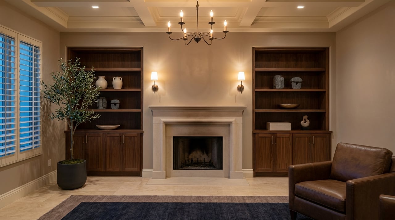
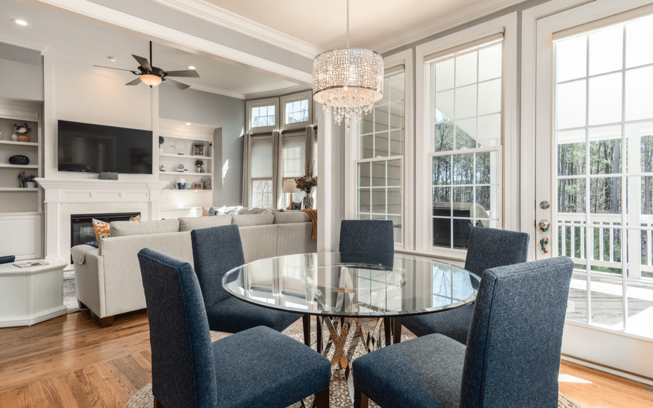
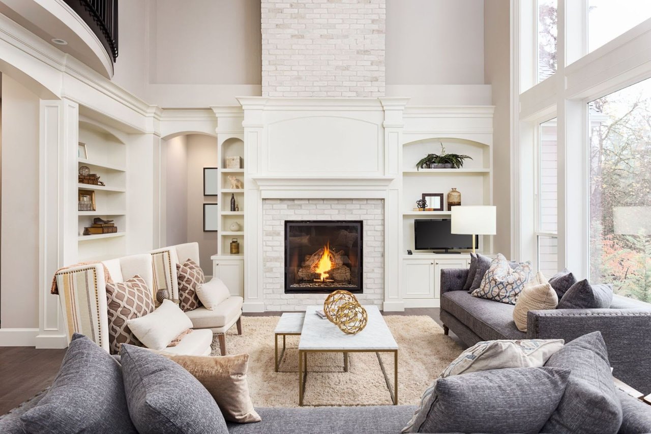
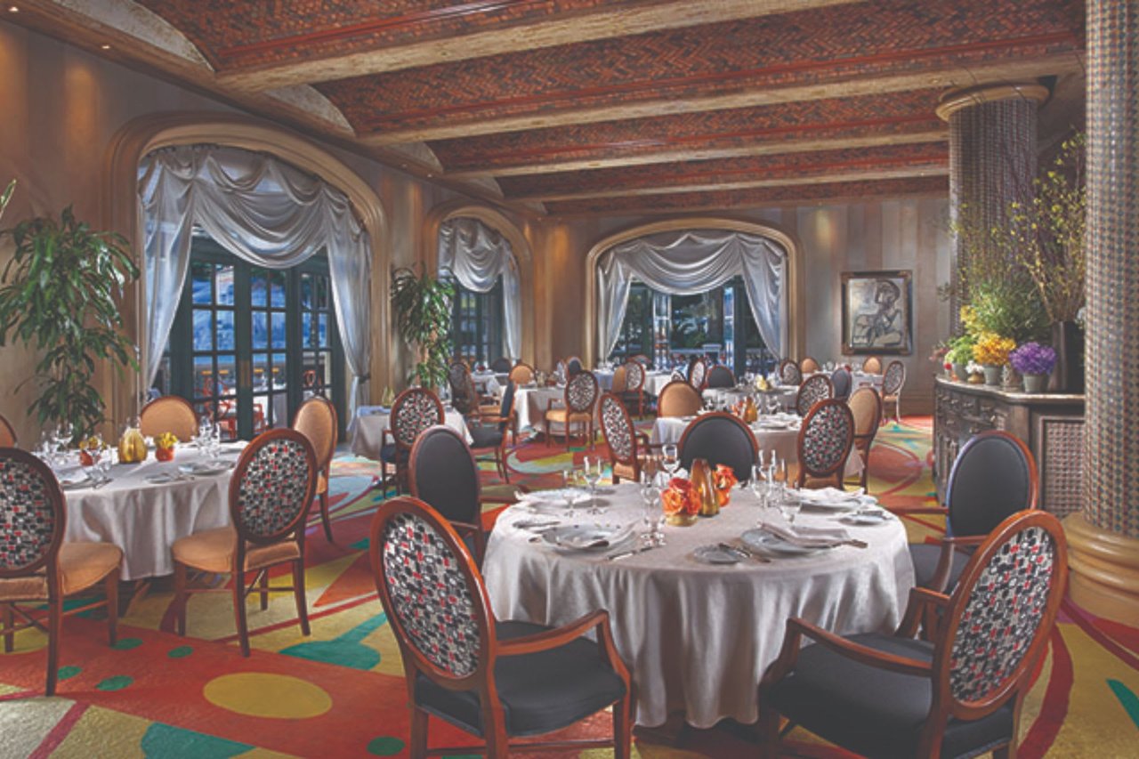
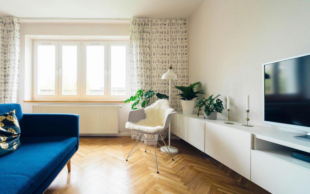
Living Room
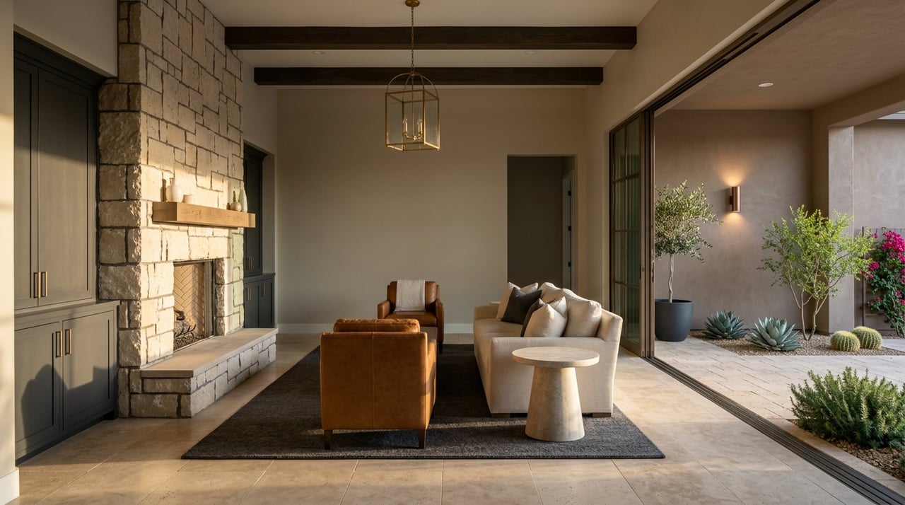
This is where guests gather and families spend time together. Warm neutrals like tan, greige, or creamy white create a welcoming environment. For a touch of sophistication, try a muted green or navy accent wall. These shades pair beautifully with natural materials and metallic finishes.
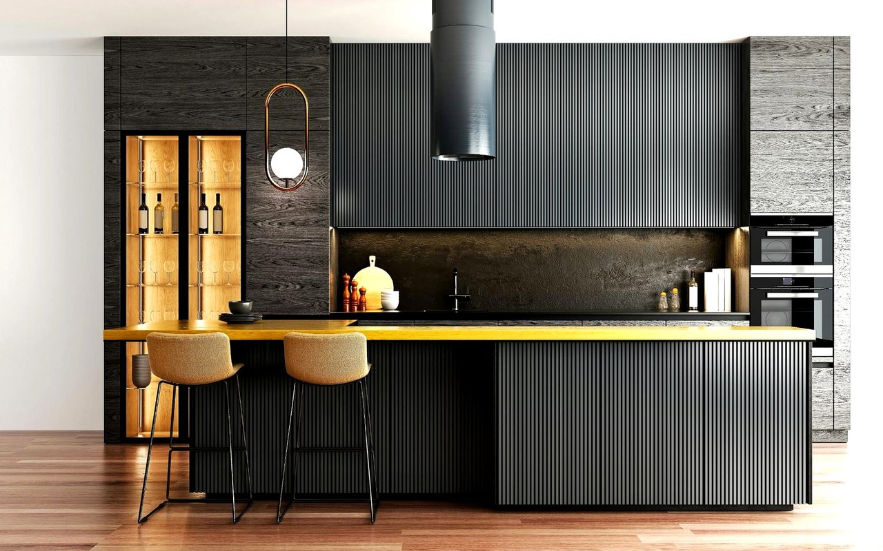
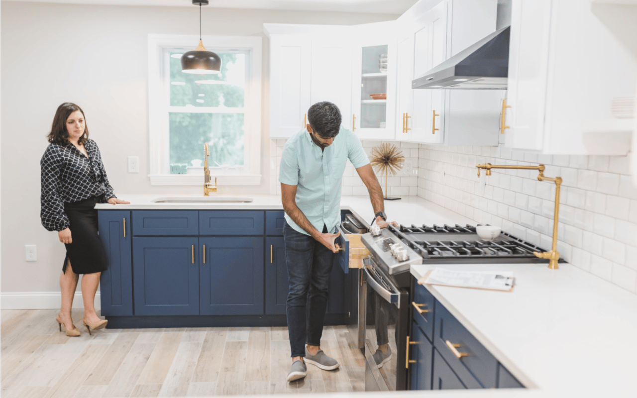
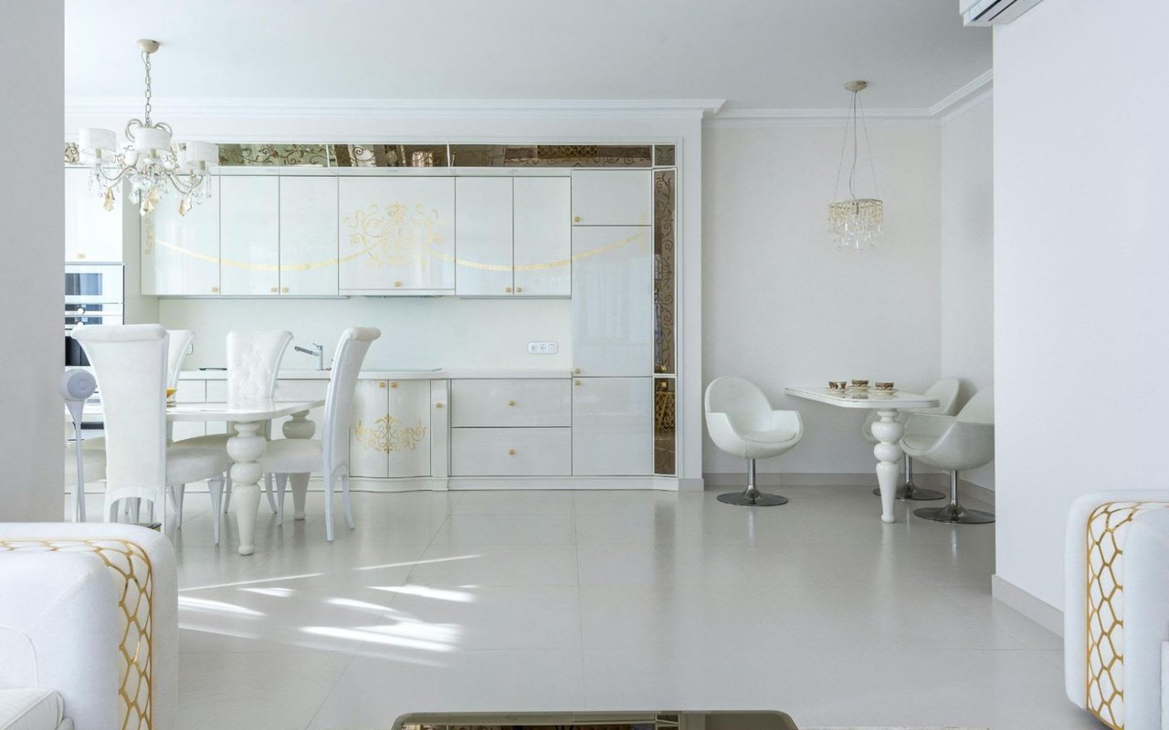
Kitchen
Color can make a big impact in the heart of the home. Soft yellows and sage greens bring energy and freshness, while light gray or off-white cabinets create a clean, timeless look. If your kitchen receives a lot of sunlight, cooler shades can balance the warmth.
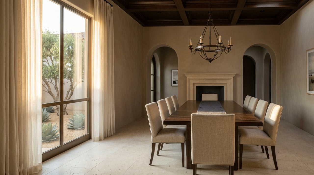
Dining Room
Rich colors enhance appetite and conversation. Deep red, warm gold, or charcoal gray can make the space feel elegant and intimate. For a modern twist, consider jewel tones like emerald or sapphire for a dramatic backdrop.
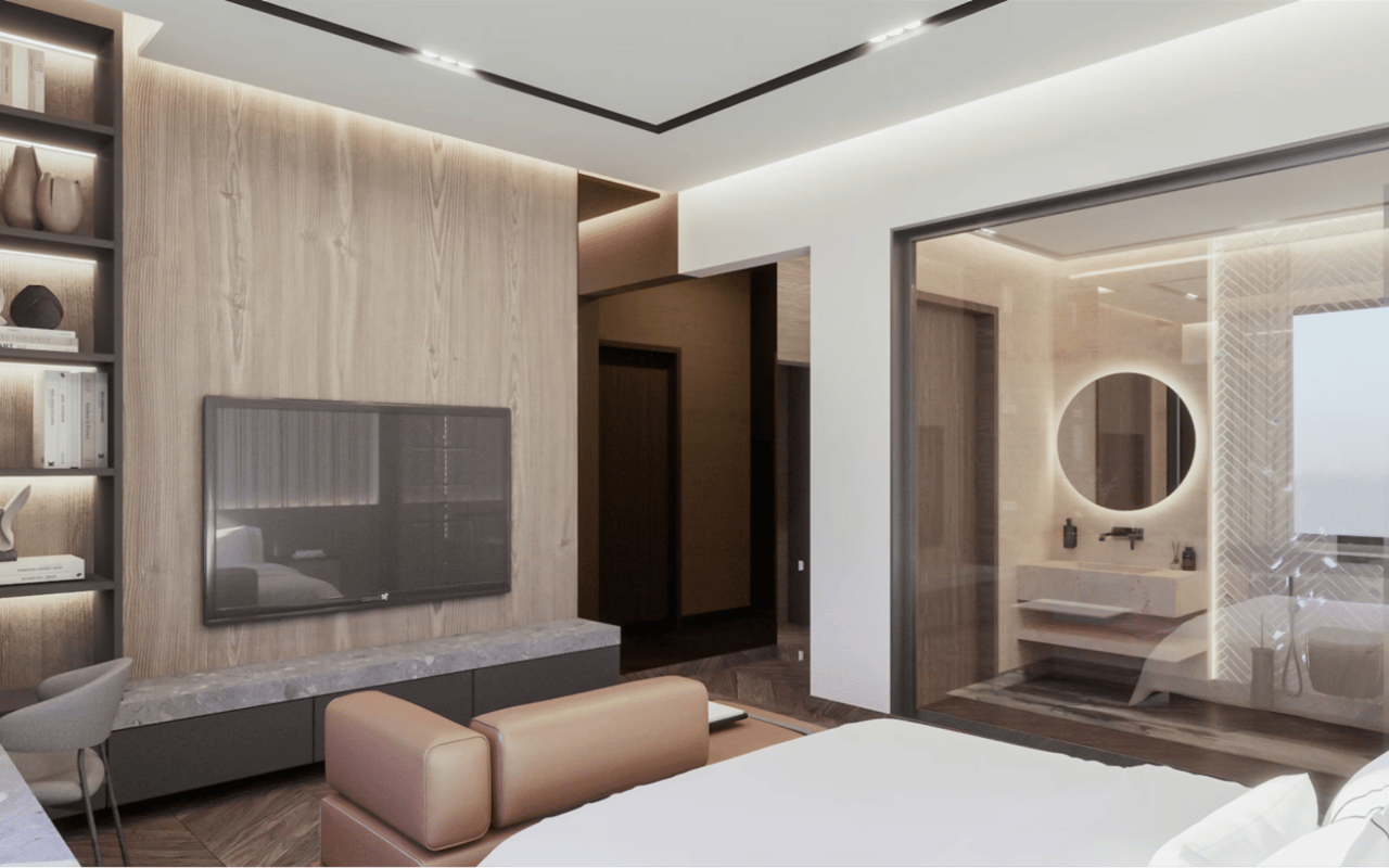
Bedroom
This is your personal retreat, so calming tones are best. Shades of blue, lavender, or pale green promote relaxation. For a cozy atmosphere, choose dusty rose or taupe with warm undertones. Avoid overly bright colors that might disrupt restfulness.
Bathroom
Light colors make bathrooms feel fresh and open. Soft aqua, powder blue, or pearl white reflect light beautifully and evoke a spa-like feel. Add contrast with darker tiles or fixtures for balance.
Home Office
In a workspace, color can boost focus and creativity. Blue enhances concentration, while green promotes calm and balance. For a contemporary vibe, try a muted olive or warm gray that pairs well with natural wood accents.
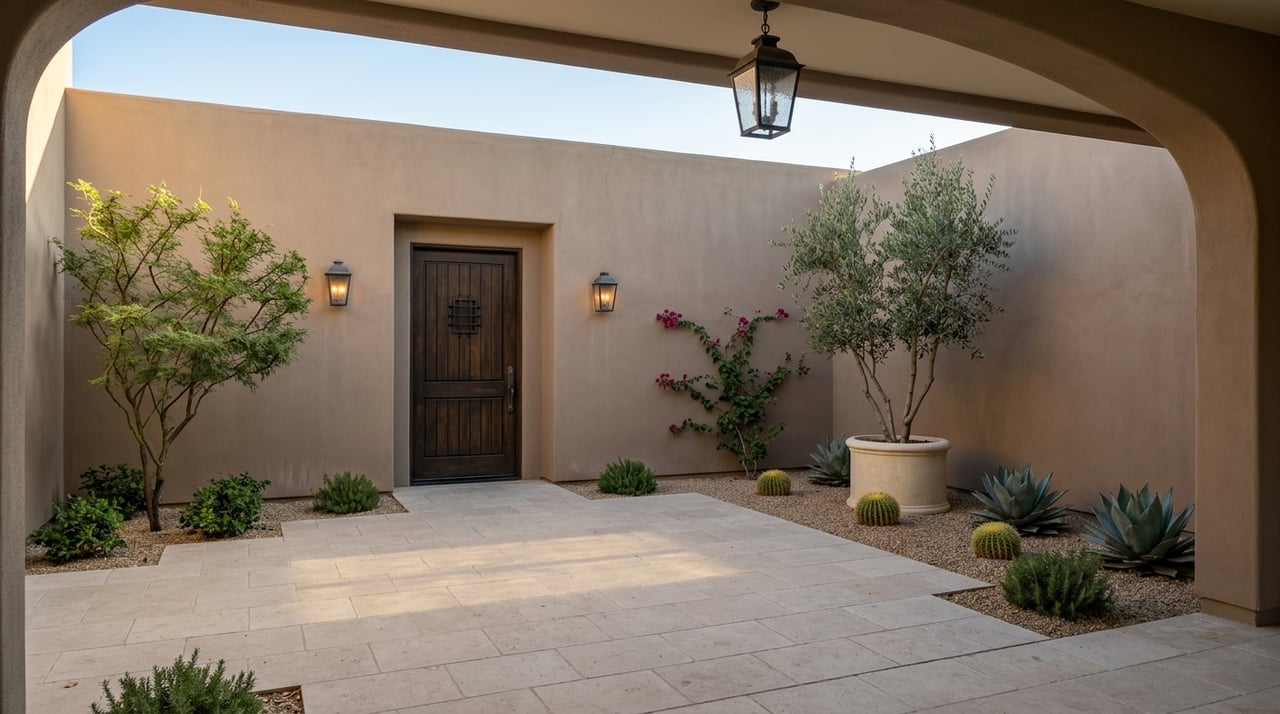
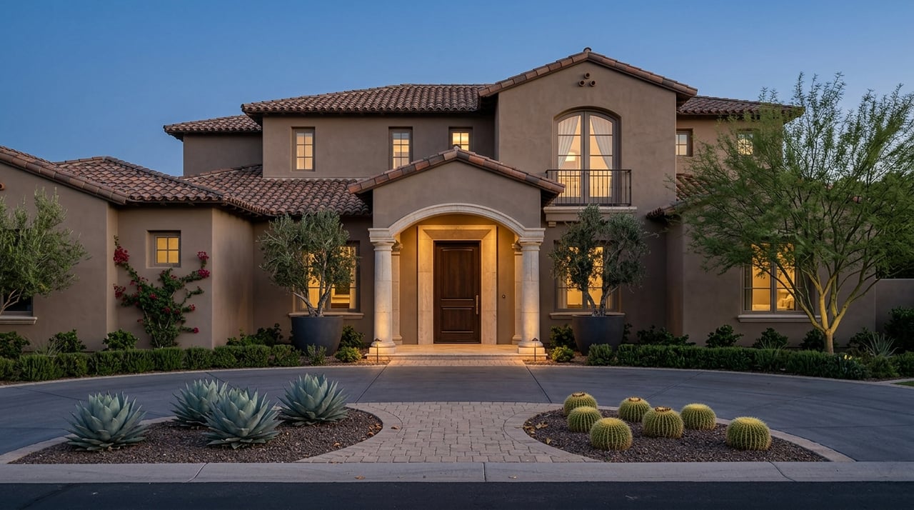
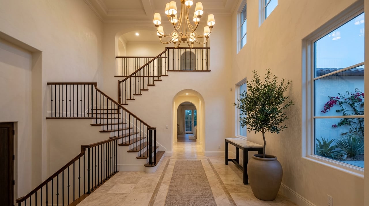
Entryway
Your entryway sets the tone for the entire home. Choose a color that reflects your personality and complements adjoining spaces. Soft neutrals keep it open and bright, while bold hues like navy or terra cotta make a memorable impression.
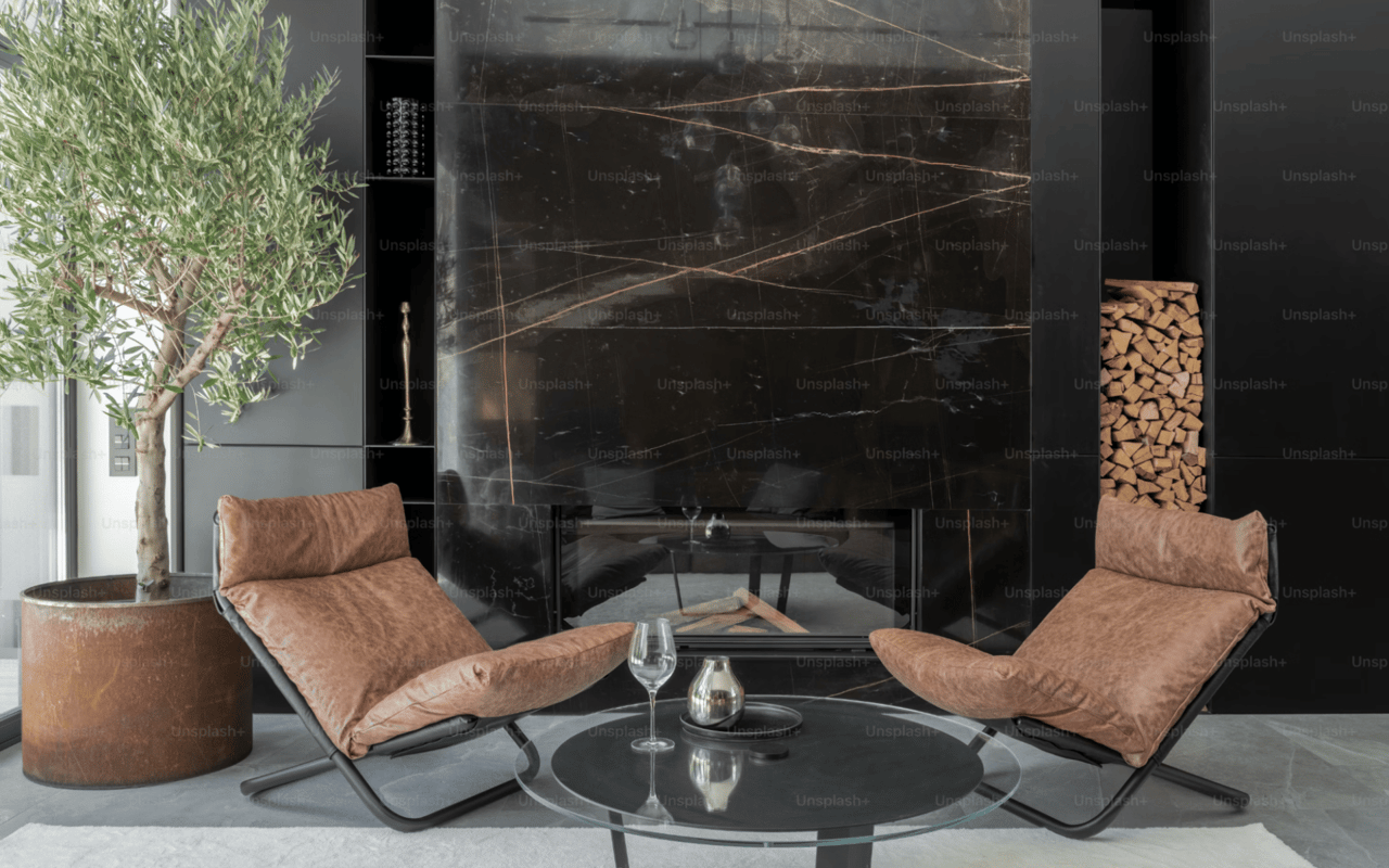
Balancing Neutrals and Bold Colors
Neutrals are timeless and versatile, making them ideal for large surfaces such as walls or ceilings. However, incorporating bold colors strategically can bring personality to your home.
Consider using vibrant tones as accents—through a single wall, artwork, furniture, or décor pieces. A neutral base allows these colors to shine without overwhelming the space.
Consider using vibrant tones as accents—through a single wall, artwork, furniture, or décor pieces. A neutral base allows these colors to shine without overwhelming the space.
For instance, a crisp white room can come alive with emerald throw pillows or a coral rug. In contrast, if your walls are painted in a deep hue, balance it with light-colored furniture and soft textures.
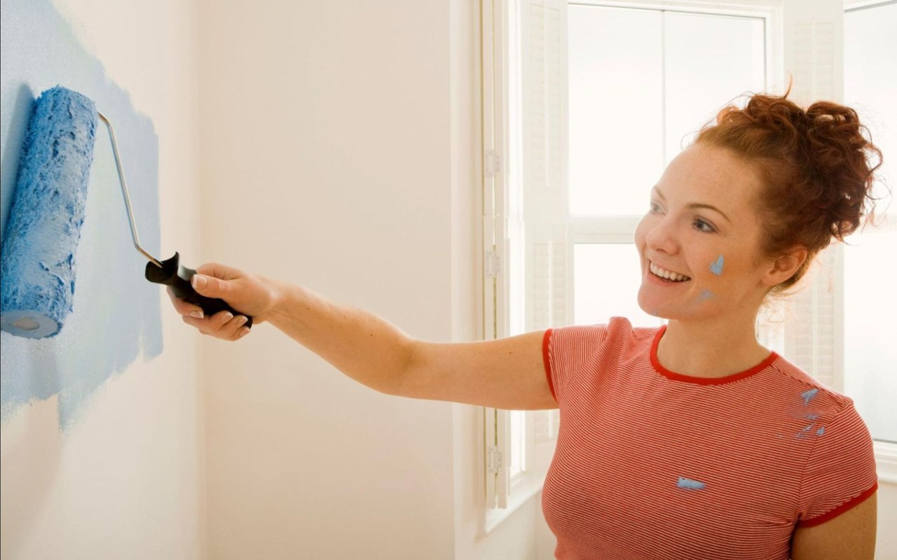
Testing and Layering for the Perfect Result
Always test multiple shades before committing. Paint samples directly on your wall rather than on paper to see how the color interacts with your lighting and textures.
Once you’ve chosen your main color, layer the room with complementary tones through textiles, artwork, and accessories. This approach creates depth and dimension, transforming flat color into a cohesive design.
Using Color to Highlight Architecture
Paint can be a powerful tool for emphasizing your home’s architectural features. Use contrasting colors to draw attention to crown molding, built-ins, or window frames. Lighter tones on ceilings make rooms appear taller, while darker tones on lower walls add intimacy and visual weight.
In open-concept homes, color blocking—using distinct shades to define areas without physical walls—helps create structure while maintaining flow.
In open-concept homes, color blocking—using distinct shades to define areas without physical walls—helps create structure while maintaining flow.
Bringing It All Together
Color choice is both an art and a science. By understanding how light, undertones, and temperature influence perception, you can create spaces that look beautiful and feel just right. Each hue contributes to your home's personality, enhancing comfort and expressing your style.
Whether painting a single room or refreshing your entire home, thoughtful color selection can dramatically elevate its appeal and value.
If you’re preparing to sell or searching for a home in Las Vegas that matches your design vision, Lisa Quam is ready to help. Her deep understanding of the Las Vegas market and eye for stylish, high-value properties make her the ideal partner for your next real estate journey.
Visit finestofvegas.com to connect with Lisa today and discover how she can help you find a home that’s as vibrant and inviting as the colors you choose to fill it with.